These two new powerful widgets are designed specifically to give leaders a high level view of what's going well (and what's not) when it comes to strategy - with the added ability to click to drill down into the detail of problem areas.
The Summary widget
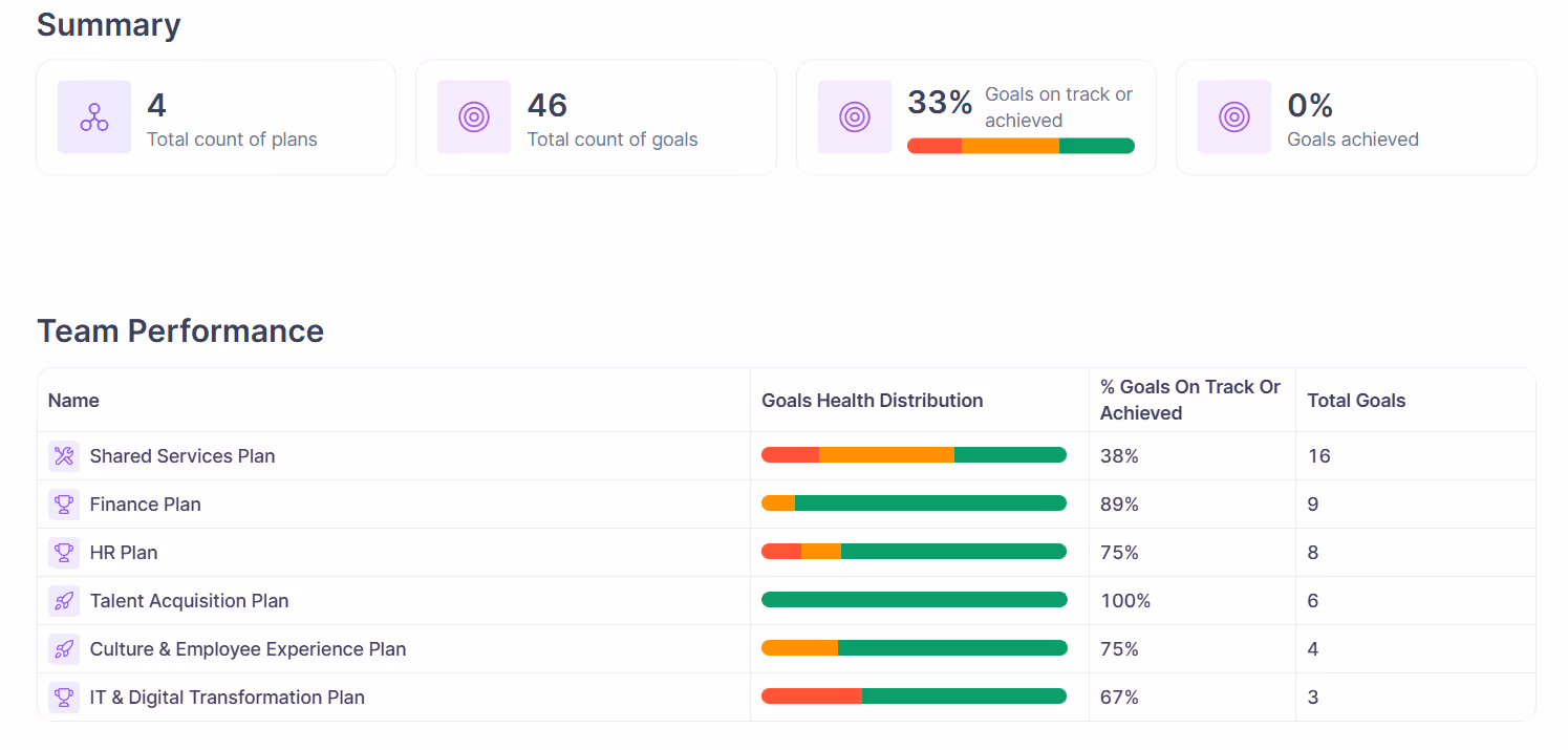
The Summary widget gives you an overview of your strategy. It shows the plans, count of top objectives, the aggregate health distribution and the the % of achievement for those top goals. This widget is available to be added to all Reports from the widget toolbar.
Usage tips
We recommend including this at the top of reports to show a broad overview of what this report covers. This is the starting point for any reader to understand what they are about to encounter in this report.
- Configure this widget filters to match the primary content of the report to ensure it's showing an accurate summary of what the report contains.
- Place this widget immediately beneath your report title for maximum impact
Plan/Focus Area Health Table
The Plan & Focus Area Health table helps you understand the health and progress across each of your plans. This table is great for helping you identify areas of your business that are performing well and areas that are not performing well.
Usage tips
- When editing the report, it's easy to switch between showing plans or focus areas in the widget by clicking the plans dropdown on the top right and selecting Focus areas.
- The Goal Health Distribution column show's the aggregate health of all top-level objectives (that match the filter you've selected) in that plan. This gives you an accurate picture of how healthy each plan is from a birds-eye view.
- This widget works really well at the top of reports to show a broad overview of how your teams are performing towards their goals (if they each have one plan) or showing how you're performing across your main focus areas.