


You might be thinking that relying on Excel for tracking KPIs is enough, but that's a bit like having a ticking time bomb on your hands. This is where KPI software steps in to offer a smarter solution.
With data fragmented across multiple analytics solutions, business intelligence, and performance management tools, businesses have run into a new obstacle that keeps them from accelerating their growth.
Organizations are running their operations blindfolded without a single source of data truth and without the ability to pivot quickly when a new opportunity arises.
The days of messy Excel spreadsheets and disconnected business tools to track progress and understand your company's performance are long gone. Companies need to reinvent their tech stack if they want to work smarter and achieve their business goals.
In this guide, we cover 12 popular KPI software tools out there that can help you create a single view of your performance, leading to better decision-making and actionable insight generation.

12 KPI Software Platforms In 2025: Selection Criteria
Is this going to be the most objective list of options out there? 👀 Of course not, since our platform is the only one we know inside and out and the only one we can recommend with full confidence.
With that in mind, we'll give you the lowdown on our platform, Cascade, but also give you a list of possible alternative options since you might need a KPI software solution different from what we offer.
Here's a list of criteria we followed during the evaluation process:
- Ease of use (including user interface and learning curve)
- Integration capabilities with other business tools in your tech stack
- Real-time functions for performance tracking and alerts when something is underperforming
- Reporting features, such as data visualization, interactive dashboards, the ability to export data, and automated time intervals to share real-time reports
- Security to keep sensitive data within the walls of an organization
- Suitability to scale across large teams and organizations
Ok, ready? Let's dive into our KPI software top picks!
1. Cascade
.avif)
Cascade is the highest-rated strategy execution platform with powerful KPI features used by high-performing teams in organizations of all sizes.
From KPI tracking to data visualization and reporting, Cascade is the ultimate KPI software. It helps you turn data into professional-looking reports and dashboards that always stay up-to-date.
But Cascade goes beyond just tracking KPIs—it connects each metric directly to your strategic objectives and initiatives, ensuring that every KPI drives meaningful progress toward your overall strategy. This alignment means that each key performance indicator is not only monitored but is actively pushing your strategy forward.
With over 1,000 integrations, you can track all important business metrics in one place and stop switching between tools. This single source of truth aligns your teams around North Star metrics and keeps everyone focused on progress toward set strategic goals.
You'll be able to closely monitor performance in a single real-time view and act immediately if you spot issues.
Save yourself the hassle of sorting through business data from various sources and then organizing them into a coherent presentation for your management board. Choose Cascade and enable smart business decisions.
What you get with Cascade:
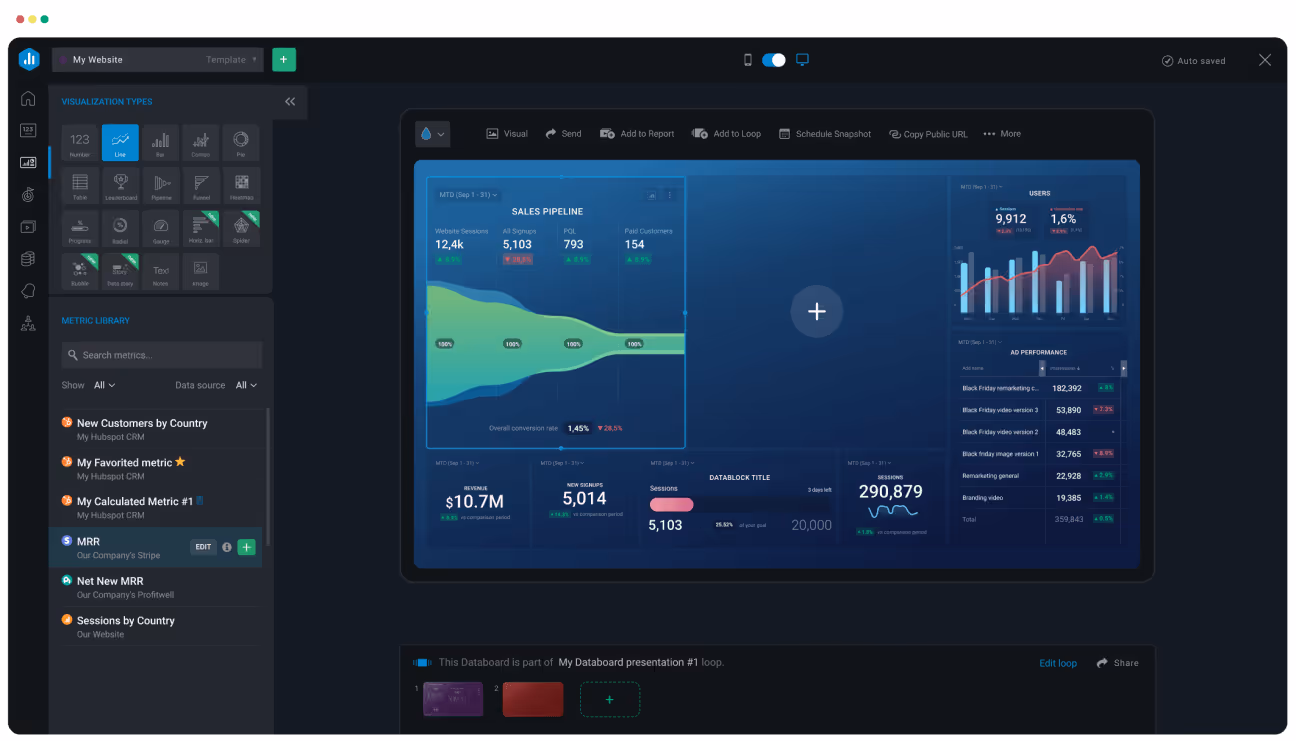
A single source of data truth to monitor progress towards your strategy and its objectives: Centralize your strategy and connect every objective, project, and KPI—all in one place—so you can ditch the spreadsheets, PowerPoints, endless meetings, and painful reports.
%2520(1).avif)
Unified Metrics Library for clear data-driven decisions: Cascade's Metrics Library allows you to effortlessly connect your business data to your core initiatives, analyzing data quickly to understand your current standing and the factors influencing your performance. This empowers you to make flexible and informed decisions.
.png)
Customizable KPI dashboards & reports with a drag-and-drop interface: Create dashboards and reports to make confident, data-driven decisions with compelling narratives and beautifully visualized data available at your fingertips.
.jpeg)
With Cascade's customization capabilities, you can build and save report templates that are tailored to your stakeholder's needs and reuse them at any time. You can even set up automatic reports with scheduled updates for your teams and stop wasting time with manual efforts.

Powerful drill-down and analytical capabilities: With KPI reports in the Cascade platform, you'll be able to get a deeper understanding of the data behind your key performance indicators. This will help you identify the underlying causes of performance issues and make more informed decisions.
Pros
- Real-time dashboards and analytics help leaders identify and eliminate bottlenecks before it's too late.
- Easy-to-use user interface allows you to quickly implement the new tool without wasting time in the onboarding process. It also helps users to quickly and efficiently navigate the platform, find the information they need, and complete tasks without frustration.
- Customizable notification options so you can notify your team members about key updates and align them around shared goals without necessary meetings and email chains. You can send updates directly to Microsoft Teams, Outlook, or Slack channels.
- A+ customer support and in-detail customer support documentation to help you get the most out of Cascade—including a comprehensive knowledge base and video library.
- Powerful data integrations to pull data from other tools in your tech stack like Power BI, Tableau, Salesforce, Excel, Google Sheets, and Google Analytics. Integrate with over +1,000 tools via native and API integrations.
- The platform supports different strategy frameworks—like the Cascade Model but also OKR framework, Balanced Scorecard, Hoshin Kanri, and V2MOM—adapting to how you and your teams work.
- Template library: Cascade has a collection of pre-built templates to help you get started, including a balanced scorecard template.
- A clear pricing structure with no hidden fees.
Cons
- Limited support for multilingual options. Videos, guides, and webinars are currently in English only (but we're working on it!)
Reviews
4.8 stars out of 5 on G2 (based on 221 reviews)
Pricing
- Cascade has a free forever version for smaller teams (up to 4 team members)
- Essentials: Talk to one of our strategy experts and receive a tailored quote.
- Enterprise+: Book a 1-on-1 tour and receive a tailored quote.
Check out Cascade's pricing page for more details!
👉 Set up a call with a Cascade expert to get a one-on-one walkthrough of the platform's features. Or, try it for free, and see for yourself.
2. Tableau
Tableau is an interactive data visualization platform and business intelligence tool. Whereas Excel is limited to spreadsheets, Tableau brings data to life with visual analytics, so you can quickly understand data, make better decisions, and solve problems—enough to make your CFO giddy with excitement.
What you get with Tableau:
- Interactive dashboards: Create AI-driven statistical models and interactive visualizations that capture people's attention and make it easy to analyze data.
- Drag-and-drop interface: An intuitive feature that makes it easy for anybody to get started with data analysis.
- AI-powered data insights: Tableau Pulse delivers meaningful insights and summaries, enabling users to understand key metrics and trends.
- Integration with Cascade: You can connect Tableau with Cascade to import your data. You can also use Zapier to set up automation between these tools.
Pros
- Team access
- Real-time reporting
- Centralized KPI dashboard to view everything in one place
Cons
- Expensive license
- Requires advanced knowledge to get the most value
- It can get a bit slow when handling larger data sets
- Lacks customization features
Reviews
4.4 stars out of 5 on G2 (based on +2K reviews)
Pricing
Tableau has two types of plans designed to fit different needs. Team plans are perfect for smaller groups looking for essential analytics tools, while Enterprise plans are built for larger organizations that need extra management, security, and scalability to handle complex data setups.
Tableau for Teams:
- Tableau Viewer: $15 user/mo
- Tableau Explorer: $42 user/mo
- Tableau Creator: $75 user/mo
Tableau for Enterprise:
- Enterprise Viewer: $35 user/mo
- Enterprise Explorer: $70 user/mo
- Enterprise Creator: $115 user/mo
3. Power BI

Microsoft Power BI is a powerful business intelligence tool that makes it easy to create and share visual KPI reports. It's all about customization, which gives your teams the chance to analyze and report on real time data in ways that make it more engaging and user-friendly.
What you get with Power BI:
- Cloud-based software platform: It's easy to create and share data visualizations across multiple data centers, which is great for collaborating on reports with remote teams.
- Advanced analytics features: It leverages historical data and machine learning techniques for predictive analytics to forecast future trends and events.
- Time-saving: Microsoft BI has a no-limit Azure data lake. In simpler terms, that means you won't waste a ton of time trying to access and pinpoint the data you need.
- Excel integration: As a Microsoft product, it's no surprise that you can connect Excel to share reports and models with your team.
- Integration with Cascade: You can integrate Microsoft Power BI with Cascade to get your key metrics all in one place, and connected to your strategy.
Pros
- Easy sharing features
- Excellent to easily visualize data
- Simple integration with Microsoft Office apps
Cons
- Steep learning curve
- Some users have reported slow performance and loading
- Compatibility issues with non-Microsoft applications
- Limited ability for multiple people to collaborate in the same file
Reviews
4.5 stars out of 5 on G2 (based on +1.1K reviews)
Pricing
- Power BI in Microsoft Fabric free account
- Pro Plan: $10 user/mo
- Premium Plan: $20 user/mo
- Embedded Plan: Contact sales
4. Databox
Databox is a cloud-based business analytics platform that has built a lot of hype in recent years. This tool gives companies a single interface to view all their KPI dashboards and reports to assess performance and guide decision-making.
When you have Databox in-house, your team can focus on the business metrics that matter, so your strategy and the decisions around it are based on a solid foundation of reliable data insights.
What you get with Databox:
- Integrated KPI dashboard: Mix and match your KPIs from many different sources into a single dashboard, so you can avoid the hassle of hopping between multiple platforms.
- Customizable dashboards: You can build your own custom dashboards to track KPIs and set up custom views—all without coding skills.
- Integrations: Automatically connects your tech stack with over 70 integrations to popular tools for marketing, social media, CRM, and sales.
Pros
- Clear, easy-to-use interface
- Easy to send and share reports
- Can update KPI data in real-time
Cons
- Expensive upper tiers
- Lacks extensive customization features related to reporting
- Limited access to simultaneous dashboards
Reviews
4.4 stars out of 5 on G2 (based on 189 reviews)
Pricing
- Free-forever account, which includes all standard features for 3 users
- Starter: $59/mo
- Professional: $199/mo
- Growth: $399/mo
- Performer: $999/mo
📚 Recommended read: How To Track KPIs To Hit Your Business Goals
5. Sisense
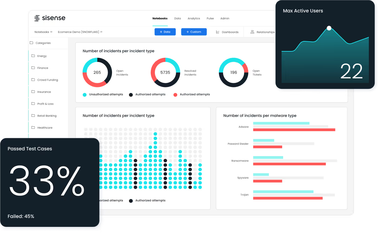
Sisense is an end-to-end intelligent data analytics software to help companies get more context around their data. You can use it to merge data from multiple sources and build visually stunning reports that give people more clarity about your performance.
What you get with Sisense:
- BI software dashboard: You can combine complex data from different sources into KPI reports that offer your team actionable insights.
- Finance KPIs: Track KPIs related to financial status to assess ROI, profits, expenses, acquisitions, and investments.
- Customer service monitoring: View customer service performance with related KPIs, like support tickets, call center stats, and customer satisfaction NPS score.
Pros
- Secure data handling
- Excellent customer support
- Effective data discovery tools
Cons
- Tricky learning curve
- Permissions settings—only the owner of dashboards and folders can publish changes
- There have been some users reporting bugs within the tool
- A heavy app that can overwhelm systems and slow loading times
Reviews
4.2/5 stars on G2 (based on 1K reviews)
Pricing
Sisense doesn't openly share its pricing on its website. While this lack of transparency may deter some people, Sisense asserts that it “is committed to ‘no-surprise' pricing.” The company will “work with you to create a customized solution that specifically meets your needs and fits your budget, whatever your use case.”
However, some users in G2 have commented about Sisense being "pretty expensive compared to some other alternatives."
6. Klipfolio
Klipfolio is a lightweight KPI dashboard tool businesses can use across multiple devices, including TVs and mobile devices. It suits small startups to bigger enterprises, helping your teams expand access to KPI reports. Klipfolio also aims to give you greater real-time visibility across your organization's performance.
What you get with Klipfolio:
- Comparative functionality: It's easy to pick and compare stats across specific periods
- Reports: Build and share interactive reports and data visualizations about your performance with key stakeholders
- Custom connectors: You can hook up your tech stack with connections to hundreds of data sources
Pros
- Access your data from anywhere
- A sophisticated editor to visualize data
- Includes pre-built dashboard templates
Cons
- Confusing documentation
- Inability to organize or edit templates
- Tricky to send and share dashboards with your team
Reviews
4.5/5 stars on G2 (based on +250 reviews)
Pricing
- Free—30 day access to all premium features for 2 users
- Professional: $60/mo which included 2 users (+$30/mo per additional user)
- Business: Customizable pricing, you need to contact their sales team
*To note: Some users have reported "pricing issues" and "confusing pricing" as one of the cons of this KPI tool in G2.
7. SimpleKPI
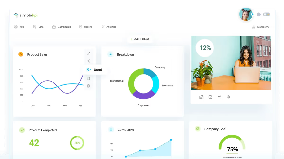
As you might guess, SimpleKPI is a platform that makes KPI tracking and reporting easier for businesses. This software is a user-friendly option that will suit technophobes and small companies that don't have data analysts and experts to manage their reports.
This KPI dashboard software focuses on ease of use and colorful visuals so that you can get more value from your data without the hassle of a steep learning curve.
What you get with SimpleKPI:
- Intuitive user interface: It's super easy for new users to get to grips with the dashboard.
- Alternate dashboard views: You can view your performance data as graphs, charts, or tables, to help you communicate your ideas and findings better to your team.
- Export tool: For old-school fans, there's an easy export tool to turn your advanced KPI report into your favorite old file formats like PDF, Word, or Excel.
Pros
- Customizable KPI dashboards and reports
- Interactive charts and graphs
- Easy to share reports, dashboards, and analytics
Cons
- Incompatible with iOS and Android devices
- Lacks some features for budgeting and forecasting
- Fixed monthly fee is very high considering the basic functionality
Reviews
They have only 2 reviews on G2
Pricing
- Free 14-day trial
- Single paid plan: $99/mo
8. Smartsheet

Smartsheet is a spreadsheet-style project management software for businesses that manage multiple large projects with a myriad of moving parts. This program is trusted by over 72% of the Fortune 500—which is incredible when you consider that it's really just a superpowered spreadsheet tool.
If you feel held back by Excel (who doesn't?), then Smartsheet is a solid upgrade that will help you manage workflows and improve collaboration.
What you get with Smartsheet:
- Easy collaboration: You can share your reports with your team members or get together on specific activities.
- Automated alerts: Make sure you never forget any important milestones or deadlines.
- Visual reports: Help your people connect their roles to the big picture with visual reports that show your employees how their work influences the company's vision.
Pros
- Automated workflows across spreadsheets
- Integrate with popular apps like Tableau, Excel, and Qlik Sense
- Support hybrid spreadsheets to share cross-department data
Cons
- Very steep learning curve and not intuitive
- Can't align KPIs with strategic objectives
- Spreadsheets don't automatically update changes for all collaborators
- More expensive than alternative spreadsheet software solutions
Reviews
4.4/5 stars on G2 (based on +17K reviews)
Pricing
- Free plan—unlocks 30 days of Business plan features
- Pro: $12 user/mo—up to 10 users
- Business: $24 user/mo
- Enterprise: Contact for custom quote
- Advanced Work Management: Contact for custom quote
📚 Recommended reading: Better Than Smartsheet: 5 Alternatives You Don't Want To Miss In 2025
9. Geckoboard
Geckoboard is a KPI dashboard software that helps teams build and share real-time business dashboards. You can connect the tool to over 80 data sources and surface key metrics from multiple sources in a single view.
What you get with Geckoboard:
- KPI dashboards: Use the Geckoboard dashboard creator to turn your data into a professional-looking customizable dashboard.
- Engaging data visualization: Filter your data to see exactly what you want and choose between different live visualizations.
- Integrations: You can easily connect your account to 80+ data sources with its powerful integrations.
Pros
- Mobile App
- Display of dashboards on TV screens
- Easy-to-use interface
Cons
- Geckoboard is primarily a visualization tool, and it lacks data analytics capabilities
- Limited customization capabilities to visualize your data
- It's not the most cost-efficient solution for smaller teams due to its pricing structure
Reviews
4.3 out of 5 stars on G2 (based on 48 reviews)
Pricing
- Free plan: 14 days free trial
- Essential: $55/mo—3 users, 1 dashboard
- Pro: $219/mo—10 users, 5 dashboards
- Scale: $769/mo—25 users, 30 dashboards
10. Datapad

Datapad is a collaborative KPI tracking and dashboarding platform for marketing teams. It's a mobile-first KPI reporting tool in the market that launched in 2021 on Product Hunt.
What you get with Datapad:
- Consolidate all your metrics: You can store all your charts, analysis, and dashboards in one place. It's like a Dropbox for your KPIs.
- Mobile-first: Gain instant access and check your metrics anytime, anywhere from your phone.
- Get your teams together: Invite your teams to collaborate and assign tasks, goals & metrics in the platform.
Pros
- KPI software designed for a seamless mobile experience
- Looks like a good choice for smaller teams and marketing agencies who need to provide numbers to their clients on the go
Cons
- It visualizes your data but it doesn't give you the big picture of how these metrics contribute to business objectives
- Some users have reported slow loading times
- Lacking some high-end features vs other competitors
- Limited documentation and support
Reviews
4.2 out of 5 stars on G2 (based on 34 reviews)
Pricing
- Free Plan (includes 1 report)
- Standard: $30/mo (5 reports +$5 for every additional report)
- Business: $200/mo (unlimited reports)
11. Google Analytics
.avif)
Google Analytics is the most well-known and used web analytics platform created by Google that allows businesses to track and analyze their web performance and user interaction. It provides valuable insights and enables organizations and business owners to make informed decisions to optimize their online presence.
What you get with Google Analytics:
- Realtime data: You can get an instant overview of your website's real-time performance on traffic, events, and conversions.
- Powerful drill-down capabilities: Google Analytics allows you to get into the data as deep as you want, enabling you to view your KPIs open by regions, demographics, type of device, etc.
- Automated Insights: With the launch of GA4, Google started using machine learning to provide automated and custom insights for your website.
- Predictive Metrics: By enriching your data with machine learning applied to your dataset for predicting the future behavior of your users.
Pros
- As part of the Google Collection, it is easy to integrate with other tools
- There's endless official support documentation and even guides and how-to videos from users
- Users can create custom dashboards and reports tailored to their specific KPIs and goals
Cons
- While it's a powerful tool, Google Analytics can be complex, especially for users who are new to web analytics
- The tool is primarily designed for web analytics, and while it provides valuable data for website performance, it doesn't offer insights into broader business KPIs beyond web-related metrics
- Since it's focused on data reporting, it doesn't integrate those web-related KPIs with the organization's strategic objectives. Users need to bridge the gap between those KPIs and the broader strategy
- Some users say GA4 is more complex and less useful vs the previous platform (UA)
Reviews
4.5 out of 5 stars on G2 (based on +6.4K reviews)
Pricing
It's 100% free!
12. DashThis
.avif)
DashThis is a KPI software specially created to help marketing teams and agencies simplify their reporting process and save countless hours that would be spent putting together these reports manually.
What you get with DashThis:
- Data Integration: The platform integrates with various marketing platforms such as Facebook, Google Ads, Google Analytics 4, Twitter, YouTube, Instagram, and more.
- Customizable Dashboards: The data from these dashboards can be tailored to include multiple data sources.
- White Labeling: Users can white label their dashboards, adding their own branding to the reports they generate.
Pros
- Visual representation of data, using graphs and charts, to simplify complex information
- Automated reporting saves time and ensures consistent updates without manual effort
- Ideal for sharing reports with non-technical clients
Cons
- Deep data analysis capabilities might be more basic compared to specialized tools
- Targeted at marketing KPIs, it's not the ideal tool for tracking overall business metrics
- Doesn't have a free plan
Reviews
4.7 out of 5 stars on G2 (based on 81 reviews)
Pricing
- Free trial (15 days)
- Individual: $49/mo
- Professional: $149/mo
- Business: $289/mo
- Standard: $449/mo
Key Performance Indicators + Cascade = Centralized Strategy Execution 🚀
The longer you cling to existing systems, the less you grow—yes, we’re talking about spreadsheets and old excel files here...
Adopting a KPI software is the smart choice to help you unlock more value in every initiative, project, and employee.
But it's not just about tracking KPIs and automating reporting—you need to connect those KPIs to your strategy to ensure you're not only moving forward but walking in the right direction.
Only then will you be able to achieve successful strategy execution and optimized business performance.
When you want to pick a KPI software, you need a platform that enables you to do the following:
- Know the status of your strategy in real-time. Your KPI reporting software must allow you to track KPIs while automatically measuring the success of your strategic initiatives.
- Minimize context switching. You can connect your favorite tools with integrations to manage everything in one place.
- Give everyone access to the same data. Improve collaboration by keeping your entire organization on the same page and ensuring alignment across the business.
- Drive fast strategic adaptability. React quickly and effectively communicate to keep all the stakeholders in the loop.
We might be a bit biased, but we're confident that Cascade is the best KPI software available right now. While this claim might sound biased, customer reviews back it up with 4.8-star ratings.
Are you ready to get everyone on the same page with your KPIs? Book a demo to see how Cascade can help you.
.png)
.avif)
.png)


