
.avif)
Creating A KPI Report Overview
KPIs (Key Performance Indicators) form a critical part of any good strategy. Typically there are three major components you'll need to include in your strategic plan - Objectives (what you want to achieve), Projects (how you'll achieve those things), and finally, KPIs (how you'll measure your progress).
KPI reports are a key element in reporting against your business goals and priority metrics. But how do you actually go about creating KPI reports?
In this guide, we'll tackle a step-by-step process to creating a good KPI report, as well as provide you with KPI reporting templates that you can download for your own use.

What Is A KPI Report?
A KPI report is a document that includes a number of KPIs presented in a fashion that gives the reader a summary of how the organization is progressing toward a certain strategic goal (or sometimes a set of goals). This report provides valuable insights and data-driven metrics that help decision-makers assess progress, identify areas for improvement, and make informed strategic decisions.
Typical inclusions in a KPI report are:
- Multiple KPIs usually including both leading and lagging KPIs
- Data visualization, such as graphs, tables, or other formats
- Benchmarks, targets, or an element of historical comparison to measure progress
- A commentary or explanation of key variances against KPI targets
Visually, KPI reports can take several different forms, which will vary depending on the stakeholders they’re addressed to and the specific data being displayed.
Why Are KPI Reports Important?
KPI reports are important because they allow you to track KPIs providing you with an up-to-date summary of how well an organization is delivering against its strategic goals. Depending on your role, there are a few reasons why you might want to consider preparing a KPI report, including:
- To keep your team up-to-date with real-time information about progress against your business objectives
- To give your investors/board members/superiors or other stakeholders a balanced view of your business' performance
- To improve decision-making by knowing which parts of your strategic plan are completed, versus parts that need additional attention
- To provide early warning signs about problems in your business strategy before they become full-blown emergencies
KPI Report Examples
Let’s explore some KPI report examples that are commonly used by organizations to assess performance and gain actionable insights across different functional areas. Each of the following focuses on specific metrics relevant to its area, giving valuable information for decision-making and continuous improvement.
Financial KPI Report
The Financial KPI Report is a valuable tool that centers around key financial performance indicators. Its primary purpose is to track the financial health of the organization, assess profitability, identify cost-saving opportunities, and provide crucial insights for informed financial decision-making.
Examples of financial KPIs in this report could be:
- Cash Flow: Measures the net amount of cash flowing in and out of the organization during a specific period, providing insights into liquidity, cash management efficiency, and meeting financial obligations.
- Net Profit Margin: Calculates the percentage of revenue remaining as net profit after deducting expenses, indicating profitability and efficiency in converting revenue into profit.
- Revenue Growth: Tracks the percentage increase or decrease in revenue over a specific period, reflecting sales generation, market expansion, and effectiveness of sales strategies.
- Conversion Rate: Evaluates the percentage of potential customers who complete desired actions, such as making a purchase or achieving specific goals, reflecting the efficiency of marketing and sales team efforts in converting leads into customers.
👉🏻Discover other financial KPIs in our article: 15 Financial KPIs And Metrics Every Business Should Track (+Template)
.png)
Customer Service KPI Report
The Customer Service KPI Report focuses on effective kpis to deliver exceptional customer service. Its objective is to evaluate the organization's customer service performance, identify areas for improvement, and provide insights for enhancing overall customer interaction.
Specific customer service KPIs often included in this report are:
- Customer Satisfaction Score (CSAT): Measures customer satisfaction through surveys or feedback, providing insights to enhance the customer experience.
- Customer Retention Rate: Evaluates the percentage of customers retained over time, reflecting overall satisfaction and loyalty.
- Customer Acquisition Cost: Measures the average cost to acquire a new customer, guiding optimization of marketing and sales efforts.
- Lifetime Value: Calculates projected revenue generated throughout the customer's relationship, informing retention and loyalty strategies.
- Churn Rate: Measures customer attrition, identifying reasons for churn and guiding efforts to improve retention.
👉🏻Check our other customer service KPIs here: Customer Service KPI Examples - The 12 KPI Metrics You Need to Track!
Marketing KPI Report
The Marketing Report is a powerful tool that focuses on evaluating the effectiveness of marketing initiatives through Marketing KPIs. Its main goal is to assess the success of marketing campaigns, measure performance, and provide valuable insights to guide strategic marketing decisions.
Examples of Marketing KPIs that could be found in this report are:
- Website Traffic: Measures the volume of visitors to the website, providing insights into the reach and visibility of marketing efforts. It helps evaluate the effectiveness of online campaigns, search engine optimization (SEO) strategies, and content marketing initiatives.
- Social Media Engagement: Tracking metrics such as likes, comments, shares, and followers on social media platforms provides insights into audience engagement and the effectiveness of social media marketing efforts.
- Return on Investment (ROI): Assesses the profitability of marketing campaigns by comparing the cost of marketing activities to the revenue generated. It allows to optimize resource allocation, improve budgeting decisions, and identify the most effective marketing channels.
👉🏻Explore other Marketing KPIs in our article: Digital Marketing KPI Examples - 12 Digital Marketing Metrics to Track
Other KPI examples for your reports
There is a wide range of other key performance indicators (KPIs) that cater to different roles, departments, and functions within organizations. These KPIs offer valuable insights and help evaluate performance in specific areas of focus.
To dive deeper into specific KPI examples, check out these dedicated articles.
By business unit/department:
- HR KPIs
- Sales KPIs
- IT KPIs
- Health & Safety KPIs
- Change Management KPIs
- Product Management KPIs
- PMO KPIs
- Operational KPIs
Industry-specific:
💡Don’t know where to start? Check out our FREE KPI Cheatsheets, a huge collection of KPI examples for almost any industry.
How Do I Build A KPI Report?
Now that we've established why KPI reports are valuable and explored the different types and examples, let's dive into how to actually create your own KPI report to fulfill the needs of your organization.
We've broken the process into a series of steps with examples. You can also go ahead and download our KPI Reporting Template to work on as you follow the process.
1. Determine the report’s scope
The first step in the process of creating a good KPI report is to be very specific about what you're trying to represent. Don't even think about starting to create a KPI report until you know what you're trying to accomplish!
The easiest way to think about the scope of your KPI report is to complete the following sentence:
I'm trying to show ___[who]___ how ___[what]___ is progressing for the purpose of ___[why]___.
For example:
- I'm trying to show my investors how our revenue metrics are progressing for the purpose of securing additional investment.
This is an example of the scope of a very specific KPI report with a very specific purpose. Alternatively, you might have a broader purpose for your KPI report such as:
- I'm trying to show my team how our overall business metrics are progressing for the purpose of keeping them in the loop about the performance of the business.
This is a much less specific scope but is equally valuable to specify. The reason we do this is that by knowing our audience, as well as our subject and our intended outcome, we can more effectively make decisions about the content of our KPI report.
💡Pro tip: In this step, you can also determine a time frame for your report. Will you showcase the progress of your KPIs over the past month, or will you opt for a quarterly overview? Understanding the time frame will help you establish the frequency and cadence with which you'll create and share your reports.
2. Define the type of KPI report
There are several ways that you could go about presenting your KPI report. Here are two KPI reporting examples of the most popular formats:
KPI Dashboard
A KPI dashboard showcases important metrics and emphasizes visual impact over depth of data. In other words, KPI reporting dashboards look impressive, as they typically include lots of colorful graphs and charts.
But the amount of data that you can usually include in a KPI reporting dashboard is somewhat limited by the amount of space that these charts occupy on the page.
Since you'll want to keep your KPI report to only a few pages, this can cause an issue if you want to represent large volumes of KPI data in a dashboard style.
Here's an example of a typical KPI Reporting Dashboard:

As you can see, this KPI reporting includes several charts as well as large printed numbers that draw attention to the KPIs in question.
KPI reporting dashboards are great for the following scenarios:
- Presenting in-depth data for a very specific topic (such as demonstrating progress against a single strategic objective).
- Presenting high-level data for a broader overview of your organization (such as a high level summary of the major KPIs for your entire business).
- Creating a strong sense of 'polish' around your KPI reporting (such as to impress boards, investors, or for public presentations).
If you like the idea of creating a KPI dashboard, the good news is that we've written a dedicated article on how to create KPI dashboards (including loads of examples). So do check that out for a bit of inspiration for your own KPI dashboard!
KPI Snapshot
Another way of representing data for your KPI reports is to opt for a more tabular style of presentation (sometimes known as a 'Snapshot').
The table style of KPI reporting allows you to include a lot more data than the dashboard style - but at the expense of visuals such as charts.
The inclusion of historical data (such as progress over time) is also more limited in the table style since you're showing absolute values for data points rather than a visual representation of progress (such as a line on a graph).
Here's an example of a KPI report in a feature-style:
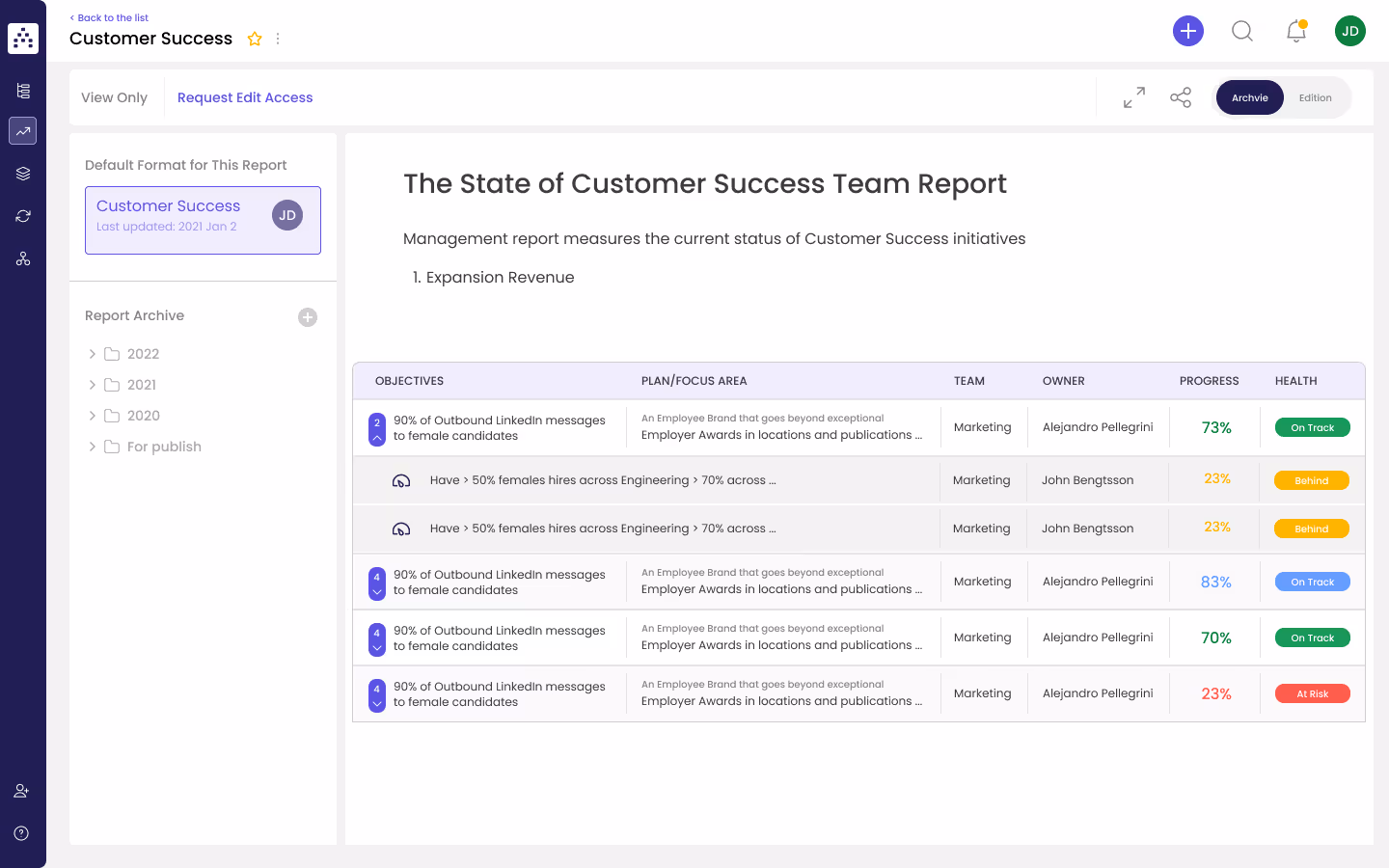
The table-style of KPI reporting is harder to digest at first glance, but on deeper inspection actually provides more data than the equivalent dashboard-style KPI report.
Times to opt for a table-style of KPI reporting might include:
- When presenting to people who are already very familiar with the subject matter and value increased depth of data over visual polish.
- When presenting deep drill-downs of data for a specific set of KPIs.
- When KPIs have many different elements/indicators (rather than just a simple 'progress' number).
There is no right or wrong way to represent data on your KPI reports, so play around with a few different styles and even test them out on your audience to see which gets the better response.
👉How Cascade helps:
With Cascade, you can easily create powerful strategy dashboards & actionable reports that show the progress of your KPIs in real-time. This way, you can discover insights to make confident, informed decisions and build compelling narratives with visualized data.
If you're using strategy execution software like Cascade, it's going to be much easier to experiment with different data visualizations than if you're using more old-fashioned forms of reporting, such as Excel or PowerPoint.
3. Choose the different KPIs to include
The next part of the process of creating your KPI report requires selecting which KPIs you want to include.
Assuming you already have a set of KPIs in your strategic plan, choosing which KPIs to include is actually not all that difficult.
There is no 'right' number of KPIs to include in your report - but as a rule of thumb, if you're producing a KPI dashboard report, try to keep the total number to around 6, and if you're producing a table-style KPI report, try to keep it to less than 20.
Before selecting your KPIs, one critical step that you need to perform is to divide your KPIs into 'leading' and 'lagging' KPIs.
You'll want to include a mix of both types of KPIs on your dashboard. If you need a refresh on the differences between leading and lagging KPIs, check out this article. But as a quick summary:
- Leading KPIs are KPIs that give you an indication of whether or not you're heading in the right direction.
- Lagging KPIs are the actual results of your efforts.
An example of a leading KPI would be 'Number of website visitors'. Whereas a corresponding lagging KPI might be '$ value of sales'. Why? Because the number of website visitors is not in of itself the desired outcome, but rather something that leads (hopefully) to the actual desired outcome, which is sales.
Structure your KPI report to tell a story, so that when you present it, you're not just running through a list of numbers, but actually painting a picture of what's happening and why.
Don't forget to refer back to your scope (step 1) when selecting your KPIs - you need to ask yourself:
Do the KPIs I selected work to deliver against the scope of my KPI report?
4. Consider your data sources
During this important step, it's crucial to think about the data sources you'll tap into to gather the information for your KPI report. You want to make sure that your data is not only reliable but also up-to-date and directly relevant to the KPIs you have selected (in the previous step!).
💡Remember: accurate and trustworthy data forms the backbone of meaningful analysis and informed decision-making.
To ensure that your KPI report reflects the reality of the situation, keep these factors in mind:
- Reliability: Choose data sources that are reliable and accurate. By relying on trustworthy sources, you can be confident that the information in your report is dependable.
- Up-to-date information: Always use the most current and up-to-date data (or ideally real-time data) in your report. Regularly update your data sources to maintain the relevance and effectiveness.
- Relevance to chosen KPIs: Select data sources that directly align with the specific KPIs you chose to measure, and that will provide meaningful insights into their performance.
- Data integrity: Scrutinize the data from your sources to ensure its integrity. Look out for any anomalies, inconsistencies, or potential data quality issues that may compromise the reliability of your findings.
👉How Cascade helps:
Tired of piecing together hundreds of pieces of information to create a report? Cascade allows you to collect all your data from throughout your organization and present it in clear, beautifully visualized reports. With Cascade’s +1,000 integrations, bring all your information together and get a single source of the progress of your KPIs in real-time.
5. Add commentary & be prepared
Often, people get super-excited about steps 1 to 4, and go off and create a beautiful KPI report - but then come unstuck when it comes to actually using it.
Remember, your KPI report is only as good as the underlying data. And furthermore, you need to have a clear idea of what you're going to change as a result of the KPI performance you're observing.
That's why we always recommend including a 'commentary' section on your KPI report.
Typically, the commentary section is where you'll include:
- An explanation for any major exceptions in the performance of specific KPIs
- Notes that relate to issues with data integrity or 'blips'
- Action plan to address deficiencies on any of the KPIs you're reporting on
Not only are KPI commentaries useful for people reading your KPI report, they also force you to think about the data when you're creating the report - meaning that you'll be better prepared to answer questions when you come to actually presenting your KPIs.
👉How Cascade helps:
In Cascade, you can collect qualitative, contextual updates on how initiatives are progressing from your teams. Record videos, write notes, and more to document the journey for stakeholders.
%20(1).gif)
KPI Report Template
To help get you started, we've created a couple of different KPI report templates. You can download them here. One is a dashboard-style template, and the other is a table-style KPI report.
You can easily customize them to your organization’s needs, but they should be enough to get you started and provide a bit of inspiration.
More Resources For Creating KPI Reports
We know that we've glossed over some of the harder parts of actually writing KPIs themselves, so here is a list of resources that you might want to check out to help you out:
- How to Write KPIs in 4 Steps + Free KPI Template
- What is a KPI Meaning? How to Set KPIs + KPI Generator
💡Pro Tip: Use the SMART methodology when writing your KPIs. This means making sure they’re specific, measurable, achievable, relevant, and time-bound.
Streamline Your KPI Reporting With Cascade 🚀
Cascade is not just another reporting tool... Cascade’s software platform helps businesses connect siloed metrics, initiatives, and investments with their realized performance for accelerated decision-making.
It acts as your Strategy Dashboard Reporting Software to help you:
- Visualize KPIs on highly customizable dashboards, powered by automated goal tracking.
- See your data in multiple formats: graph, table, gantt, and more.
- Build the perfect strategy dashboard using highly customizable widgets.
- Share your dashboards with anyone - both inside and outside the organization.
- Simplify strategy reporting with real-time reports configured to run with a single click!
💪🏼Ready to experience the power of Cascade? Sign up today for a free forever plan or book a guided 1:1 tour with one of our Cascade in-house strategy execution experts.

.png)